When Assembly brought me in, the brief was almost nothing. The homepage wasn't working. That was it. No research doc, no defined personas, no list of things to fix. Just a feeling and an invitation to figure out why.

Role & Team
Founding Product Designer
Competitive research, UX, UI, visual design, copywriting direction
Small marketing team + two stakeholders. I was the only designer.
22 weeks from first audit to final delivery
Context block
Assembly is a B2B SaaS employee recognition platform used by companies like T-Mobile, Coca-Cola, and Toyota. They'd grown feature by feature, and the homepage had followed, becoming a page that listed everything they could do without arguing for any of it.
Over 22 weeks, I redesigned the full homepage from diagnosis to final handoff. It's the page every first-time visitor sees.
Problem
Assembly's whole pitch is that recognition drives engagement. The homepage didn't make you feel that.
Cartoon illustrations filled every section, the kind you'd seen on a dozen other HR SaaS sites. Features were listed, not shown. Sections appeared in the order they were added, not in the order a buyer's mind actually moves. The page felt like a brochure, not an argument.
And in B2B SaaS, where a buyer is evaluating you against four other tools before a demo call, a page that doesn't convince fast enough just gets closed.
Approach
I spent the first week studying how high-converting B2B SaaS homepages structured their arguments — Notion, Linear, Loom, Intercom. The pattern I kept seeing: they led with the feeling of the product, not the feature list. You understood what it was before you'd read a single bullet point.
I mapped the buyer's journey through the page before touching a layout. What does someone need to believe after the hero? After the social proof strip? After the features section? Every section needed a job, not just a heading.
My first attempt at the hero led with a bold stat — "Over 200+ Five Star Reviews." I removed it. Buried credibility reads as desperation when it's the first thing someone sees. The credibility needed to come from showing the product, not announcing the reviews.
Challenges and trade-offs
The hardest decision was stakeholder pressure to show all six Assembly product solutions on a single hero screen
I tried it. Six solutions competing for space meant no solution had space. Headlines shrank. Visuals got cropped. The screen that was supposed to communicate everything communicated nothing.
I brought the data back to the team: high-converting B2B pages give one idea room to breathe before introducing the next. We agreed to sequence the solutions into dedicated sections instead of collapsing them into one. Each solution got its own visual treatment. The page breathed.

Solution
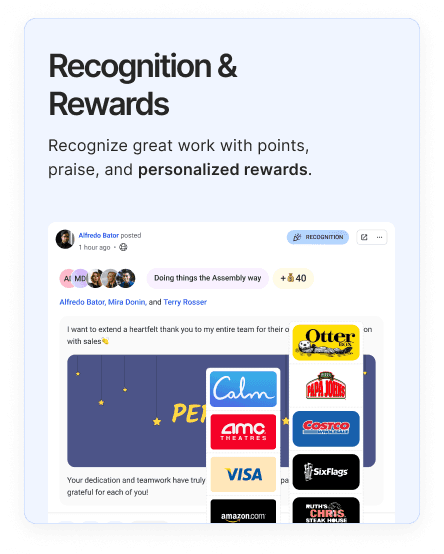
The new homepage leads with product UI — real recognition feeds, real manager dashboards, real notification surfaces. When someone sees an actual feed with actual names and actual reactions, they picture their team in it. A cartoon of two people giving each other a high five does not do that.
The feature sections follow a narrative sequence: recognition → engagement → insights → integrations. That's the order a buyer's thinking actually moves. Each section has one visual, one point, one CTA.
I buried the stat — but I didn't remove it. "71% of companies deprioritize recognition despite it being a top driver of retention" moved from a footnote in a blog post to a section anchor that reframes why Assembly exists. That single number changed the page's persuasion logic from "look what we can do" to "here's what happens if you don't."
The navigation got cleaned up too. Links that pointed nowhere were removed. The primary CTA — Get a Demo — appears in the nav, the hero, and at the bottom. On a page this long, the conversion moment should never be more than one scroll away.

Results & Impact
The redesigned homepage shipped and became the visual foundation for every subsequent Assembly marketing surface — ads, emails, decks, landing pages all reference it.
Assembly's broader metrics predate the redesign and reflect years of growth, so I don't present them as outcomes of this work. What I can say: the page went from something designers internally called "unclear" to the strongest marketing surface the company had.
The process of doing this audit is also what led to the deck system project — once I understood how buyers moved through Assembly's story, it changed how I approached every subsequent piece of communication they made.

See your entire financial picture in one place with performance attribution and gain/loss analysis.